NR-538 is the first half of a two course population health sequence, three theory hours, focused on assessing a population and analyzing the findings to identify resources, risks and disparities. It is the data gathering course. The planning and evaluation half comes afterwards in NR-539, and trying to write the intervention here is the most common way students misread the assignment.
What NR-538 actually grades
The first scored skill is assembling a picture of a population from sources that were never designed to fit together. Census products describe who lives somewhere. Health department reports describe outcomes. Service directories describe what exists. Community informants describe what actually happens. Each has a different geography, a different collection year and a different definition, and the graded work is combining them while saying where the seams are.
The second is analysis rather than compilation. A list of statistics is a data dump. An analysis says what the numbers mean together: that the outcome is worse here than in the surrounding area, that the service exists but is open only during working hours, that the risk concentrates in one age band, and that the three facts are connected.
The third is naming assets as well as deficits. A population assessment that describes only what is wrong misses the resource half of the catalog description and produces a picture no plan can be built on.
How we help in this course
NR-538 has no clinical hours, so nothing on our side touches placement, preceptors, site paperwork or logs.
Send the prompt and the scoring guide from Canvas and a premium original draft returns in 24 to 48 hours, planned against the criterion rows, with every figure carrying its source, base and collection period and every mismatch between sources named rather than hidden. The draft clears both quality passes and the floor check first, and revision is free until the report lands.
Writing this course's deliverables from the rubric
Rubric, boundary, sources, comparison, interpretation. Fixing the geographic boundary before collecting anything saves more time in this course than any other single decision.
In NR-538 right now?
Send the week and the rubric from Canvas. First premium sample free, floor-checked, back in 24 to 48 hours.
The floor in the first half of a sequence
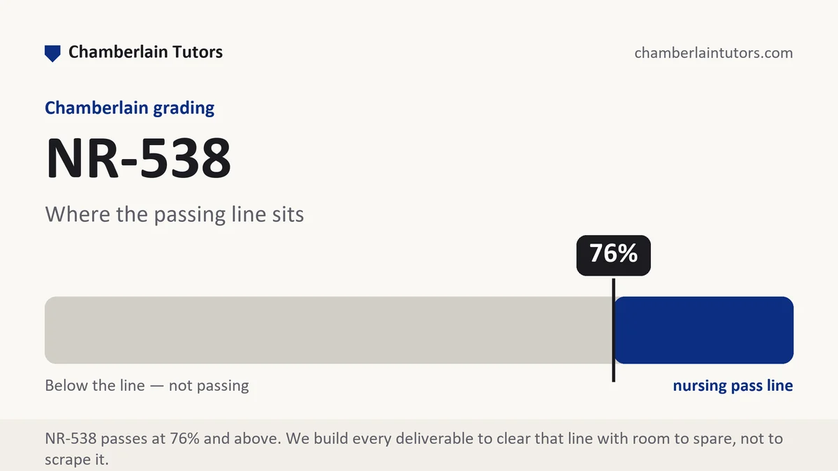
Core nursing courses pass at 76 percent, and where a track uses the nurse practitioner specialty scale, which has no C band, the last passing number is 84. A two course sequence adds a second consequence: the assessment you produce here is usually the foundation for the planning course that follows, so a thin data picture costs you twice.
Sixteen week semesters carry two eight week sessions each, up to six starts happen in a year, deliverables come weekly, and supplementary work cannot lift a weighted average. Choose the population in week one and start pulling data the same week, because public data sources take longer to locate than students expect and a late start compresses the analysis rather than the collection.
Turn the criterion rows into a section plan
Copy the criterion rows into a blank file in printed order and reduce each to its verb: define, collect, compare, analyze, prioritize. Those verbs become your headings in the guide's own sequence, which stops an assessment report from turning into a list of tables with commentary underneath.
Then convert weight into a word budget, which matters here because these are among the longest papers in the sequence. Suppose the assignment caps you at 2,100 words across four rows weighted 35, 25, 25 and 15 percent, giving roughly 735 words, 525, 525 and 315. If the 35 percent row is analysis rather than description, and it usually is, then 735 words belong to interpretation and only the remainder to reporting what you found, which is the reverse of how most drafts are distributed. The 315 word row is often the prioritization section, one solid paragraph naming which problem you would take forward and why.
Keep the budget beside each heading while drafting. Title page and references sit outside the count unless your guide says otherwise, and data tables and maps usually do too, which is exactly where raw figures belong so the prose can carry meaning instead of numbers.
The shape of a population assessment
Most graded writing here is an assessment of a defined population supported by data from several sources. Each part below is something a reader needs before any figure can mean anything.
| Part | What it has to establish | How the thin version reads |
|---|---|---|
| The boundary | The exact geography or group, and why that boundary, since every later number depends on it. | A city named loosely with data drawn from three different areas. |
| Who lives there | Size, age structure, income, language, housing and work, each with its source and collection year. | Demographics copied without dates or definitions. |
| Health outcomes | The measured results for this population, with bases and periods, alongside a comparison area. | Outcome figures with nothing to compare them against. |
| Assets and services | What exists: clinics, transport, food sources, schools, faith organizations, informal supports, with access conditions. | A list of facilities with no mention of hours, cost or distance. |
| The synthesis | What the sources say together, including where they disagree and which one you trust for what. | Each source summarized in turn with no integration. |
| Priority and rationale | The one or two problems you would carry forward, with the criteria used to choose them. | A list of problems in the order they were found. |
Evidence and citation craft with public data
This course lives on secondary data, and handling it properly is most of the grade.
- Two dates on every figure. The year the data describes and the year it was published are different, and readers need the first. Where the collection year is more than five years old, say why the figure is still the best available.
- Cite the producing agency, not the aggregator. Dashboards and community data portals repackage figures from surveys and vital records. Go to the producer so you can report the definition, the base and the sampling approach.
- Method and sample before the number. Write that a telephone based behavioural survey sampled 4,900 adults in the state and estimates for the county carry wide margins, then the figure. Small area estimates from national surveys are frequently quoted as though they were counts.
- Verbs the design can pay for. Census tracts with lower median income also had higher rates of the outcome is honest. Poverty causes the outcome is not supported by area level data, which cannot tell you anything reliable about individuals.
- Denominator and window on every rate, and matched geographies in every comparison. Write that 118 events occurred among the 26,400 residents of the area over three years, and give the comparison area on the same base and the same period. A county figure compared to a state figure from a different year is not a disparity, it is a formatting accident.
The gap between a passing assessment and a strong one
A passing NR-538 assessment gathers plenty of data, presents it clearly, and concludes that the population faces several health challenges. It is thorough and inert, because nothing in it is compared to anything and the reader has no way to judge whether a figure is high.
Strong assessments always supply a reference point, whether that is a neighbouring area, the state, a national figure or the same area five years earlier, so that every number means something. They say where the data fails, naming the group a survey misses or the year that is out of date, because acknowledged gaps are analysis while unacknowledged ones are errors. And they choose a priority against stated criteria, such as size of burden, severity, availability of an effective response and community concern, which turns a description into the foundation the planning course needs.
Six mistakes that cost points here
- Sliding boundaries. Data pulled from a city, a county and a state and presented as one population makes every comparison meaningless.
- Numbers with no comparison. A rate on its own is a fact. A rate beside a reference is a finding.
- Reporting instead of analyzing. If the paper never says what two sources mean together, the analysis rows are unfed.
- Deficits only. The catalog names resources alongside risks. An asset inventory is scored material, not decoration.
- Writing the intervention. This is the assessment course. A plan belongs in the second half of the sequence, and adding it here costs the space the analysis rows needed.
- Posting to the board from the text box. Chamberlain posts stay as submitted, and a mistyped figure stays with them. Verify numbers in a document first.
Questions NR-538 students ask
How do I choose a population that will have usable data?
Can I include what people told me, or does it have to be published data?
What if the sources contradict each other?
Where NR-538 sits in Chamberlain's programs
Open the exact program map for sequence, credit, and option context. The current student schedule and syllabus remain authoritative after transfer evaluation, electives, state rules, and approved plan changes.
The weeks, one by one
Week 1
NR-538 opens with the decision that governs the entire session: what counts as your population. Read the full Week 1 manual.
Week 2
A population assessment without a framework becomes a pile of facts. Read the full Week 2 manual.
Week 3
The middle of the session is spent assembling numbers from sources that were never built to sit beside each other. Read the full Week 3 manual.
Week 4
Halfway through the session the counts become rates and the rates get compared. Read the full Week 4 manual.
Week 5
Numbers describe outcomes and rarely explain them. Read the full Week 5 manual.
Week 6
This stage builds the resource half of the assessment, and the analytic move is to take a list of services and convert it into a description of what your population can actually reach: capacity against demand, hours against when people need help, eligibility rules that exclude, distance and. Read the full Week 6 manual.
Week 7
An average conceals a distribution, and this stage opens the average up. Read the full Week 7 manual.
Week 8
The closing stage turns eight weeks of collected evidence into one argued account: what this population's health situation is, which needs rise to the top and by what stated criteria, and what remains unknown. Read the full Week 8 manual.